Monday, November 28, 2011

Map of the Week 11-28-2011:The Spread of Disease


There is perhaps no more natural use of the flow-type thematic map than to show the spread of disease.  This map, by Haisam Hussein, shows the origins and pathways of some of the most historically common and deadly of the world’s diseases, especially those with a global reach.  From: http://www.laphamsquarterly.org/visual/maps/contagion.php (go there to see detail of map)
Smallpox, leprospy, and malaria are or were all widespread health problems for millions of people, for millennia, and it is fascinating to see how these diseases diffused across the oceans and continents over time.  Now-a-days, of course, contagious diseases have a much more rapid and far-reaching diffusion, due to higher rates of international travel, increased travel between well-populated and remote areas, and the prevalence of air travel.  A new disease can get from one continent to another in a matter of hours, and diseases that were relatively local in extent can now spread throughout the world.   
We have probably all seen the maps of how the Black Plague was carried from Asia to Europe on ships, and major port cities were the ones that were affected first, in a kind of hierarchical diffusion.  Within weeks, however, the disease usually spread out from the port cities into increasingly smaller towns and villages, generally along trade routes overland, or secondary shipping routes to smaller ports.  
Trade ways in the 14th century
This is an abstract from a paper about the spread of the Plague in Sweden in the 14th century, showing just that sort of diffusion. 
“GIS (Geographical Information Science) is used to describe and visualize the effects of the 'Black Death,' the worst pandemic in man’s history. The study is limited to models for the dissemination of the disease in Sweden in 1350. Simulations are made to depict different scenarios on the dissemination of the disease as well as the drastic changes in the overall population of Sweden over a couple of hundred years.
This work is based on the prevailing theory that the disease called the “Black Death” was plague (bubonic plague), caused by the bacterium Yersinia Pestis. The model assumes that the bubonic plague is caused by the bacteria Yersinia pestis through rat flea borne transmission to humans. For purpose of validation the population decrease estimated in each parish is compared with independent historical documents. Results from model scenarios are visualized in a series of maps and/or as animated video sequences. Generated map documents can be published as web map services.” From: A GIS BASED MODEL FOR DISSEMINATION OF THE BLACK DEATH IN SWEDEN IN 1350, Skog, Lars, Hauska, Hans, Broström, Anna.  Transactions in GIS.
  
Infected rats enter ports of Southern Sweden on 1st , 10th, 20th and 30th of June 1350. Therafter
the Black Death is spreading, parish by parish…

At the end of October 1350 the Black Death has spread all over Sweden, up to the latitude of Umeå


Of course, the bubonic plague is still with us, still affecting people, it is not an extinct disease, like smallpox.  This paper is about the current conditions in Africa pertaining to the spread of plague. 

Figure 1 - Geographic overview of plague in Africa
Overall figure: projection of the ecological niche model based on all 45 occurrence locations from Sub-Saharan Africa. Dark shades indicate areas with greater model agreement in predicting areas as suitable for plague. Occurrence points in sub-Saharan Africa on which predictions were based, are shown in light blue; independent test points in Madagascar and North Africa are shown in green.  Inset: 45 occurrence points, colored differently to indicate the four regional subsets: subset A (dark blue triangles); subset B (light blue squares); subset C (green circles); subset D (pink diamonds). Sub-Saharan region shown in inset covers training region used for ENM development.
From: Geographic distribution and ecological niche of plague in sub-Saharan Africa
International Journal of Health Geographics 2008, 7:54 doi:10.1186/1476-072X-7-54
Simon Neerinckx, A Townsend Peterson, Hubert Gulinck, Jozef Deckers,
Herwig Leirs

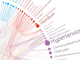
And here is something interesting from MIT's Senseable City Labs - HealthInfoScape - a way to visualize the connections between various medical conditions using 7.2 million electronic medical records of patients.
See the YouTube video at: http://www.youtube.com/watch?v=ln6arKcE99E&feature=channel_video_title
Here are the interactive maps: http://senseable.mit.edu/healthinfoscape/


Friday, November 25, 2011

Maphead


Maphead book cover 

OK, I am not a TOTAL nerd, but I happened to chance upon this nice book tour lecture event which aired on C-Span this evening.  Yes, apparently I have nothing better to do on a Friday night than scan through channels and actually stop at C-Span!  HA HA!  (very sad!) 
Anyhoo, I lingered on C-Span because I recognized that, surprise, surprise, it was a talk by Ken Jennings, the author of Maphead: Charting the Wild, Weird World of Geography Wonks, a recent book that I believe I mentioned before in this blog somewhere, probably when I was recommending geography books in a previous post.  Ken Jennings is also renowned for being a winner on the trivia quiz game show Jeopardy  - 74 times in a row, winning over $2.5 million dollars, and setting a Guinness World Book record for the most money ever won on a game show.  

They also brought him back to the show last year, to play against the IBM computer “Watson,” who beat the humans, but at least Ken came in 2nd.
Ken is truly a Maphead, having slept with a Hammond World Atlas under his pillow when he was 7 years old.  Jennings’ book is an “exploration of why maps and geography have always been so fascinating to him and to fellow mapheads everywhere,” according to the book's publisher, Scribner.  “Jennings takes a world tour, meeting countless other geo-geeks, from the antique-collecting millionaire at the London Map Fair to the map librarians in the bowels of the Library of Congress, from the pre-pubescent geniuses at the National Geographic Bee to the computer programmers at Google Earth, from the shores of Montezuma to the halls of Rand McNally.”
Although the Book TV show that I just watched on C-Span (link below) is about 40 minutes, it is a very fast moving show, and at the end (and this will be of interest to geography trivia buffs) he runs a little quiz show for the audience members.  Of course, I found it endlessly amusing to see how many of the questions I got right.  (Sample questions that were memorable enough for me to remember them: what is the “stan” country in central Asia that is completely surrounded by the other stans?  How many countries have the word “Guinea” in their names?  What is the largest desert in the world?  Until a few months ago, what was the largest country by area in Africa?  There was also a real stumper question about an enclave country in Africa, but I don’t remember it exactly.) 
When he took questions from the audience at the end of his talk, one person asked him to what he attributed his memory capacity and his vast mental holdings of information, and how would he advise a young person today to obtain and retain all that knowledge.  His answer was really great – he talked about how most of the people he ever knew who were good at retaining incredible amounts of knowledge were people who were curious, and who were interested in everything; people who enjoyed putting pieces of information together and make connections from one thing to another; seeing how everything in the world fit together.  In other words: sponges, who are fascinated by everything and absorb it all, and try to find the patterns and linkages.  In other words, Geographers. 


Separated at Birth
 From the mind of Ken Jennings:
“To this day, I see British Columbia on a map and think of it as a more robust, muscular version of California, just as the Canadians there must be more robust, muscular versions of Californians.”

Thursday, November 24, 2011

Thanksgiving Dinner Map

Happy Thanksgiving!
Map of Thanksgiving Dinner, by Grant Snider of Incidental Comics at http://thoughtballoonhelium.blogspot.com/2011/11/map-of-thanksgiving-dinner.html

I especially like the "Vast Plaid Desert," the "Mashed Potato Atoll," and the "Southern Rim"!

Wednesday, November 23, 2011

Trash | Track

Trash | Track from MIT's Senseable City Lab from: http://senseable.mit.edu/trashtrack/


On the eve of the start of our annual high consumption season (and subsequent high waste), this video from Senseable City Lab at MIT shows how trash travels within the United States.  Five hundred people in Seattle put GPS tracking devices in 3,000 pieces of trash, and the trash was tracked over time to see where it all ended up, and how long it took to get there.  Watch the YouTube video and also check out the visualization on the Senseable City Lab website.  Thanks, Tom Paino, for pointing out the link to me.  I also love that the video starts out with a quote from one of my all-time favorite authors/books, Italo Calvino, Invisible Cities: 
“Nobody wonders where, each day, they carry their load of refuse.
Outside the city, surely; but each year the city expands,
and the street cleaners have to fall farther back.
The bulk of the outflow increases and the piles rise higher,
become stratified, extend over a wider perimeter.”


 More about the project: http://senseable.mit.edu/trashtrack/

By the way, this visualization project won an award in the NSF (National Science Foundation) annual competition – International Science and Engineering Visualization Challenge.  Check out some of the other winners at: http://www.nsf.gov/news/special_reports/scivis/winners_2010.jsp  


Monday, November 21, 2011

Map of the Week 11-21-2011: The United States of Molitorious


The United States of Molitorious

This is a wonderful example of cartography forming maps in the shape of animals - zoomorphic maps - as highlighted in my recent posts on the topic (in three parts). 

Molitorious (not sure if that’s his real name, or a Latin-ized version of it) is an illustrator who decided to create a map of all 50 states, each one in the shape of a creature.  Then at the end, he put them all together to form a map of the U.S.  Here are his “self-imposed rules” for his creation:

Self imposed rules:
* Must post a new state on Tuesdays and Fridays!
* drawing cannot "go outside the lines" .. no extra bits outside border.
* most if not all states must be self contained drawings.
* drawing is to scale of a map size.. TX is bigger than Vermont(this may be tricky).
* states are alive (monster, animal, person, etc..)
* goal is to have a huge poster of all the states together at end.

Here is his website where the entire U.S. map is all together, and to look at individual maps of the states, you have to look at “Previous” postings. 

Here is New York State - a Mighty Lion!  Befitting for the Empire State! (What's up with the multiple eyes, like a fly, though?)


Thursday, November 17, 2011

What’s your favorite map projection?


What’s your favorite projection? And what does that say about you? Cartoon by Randall Munroe, from: http://xkcd.com/977/

OK, a number of you guys sent me this link to a pretty humorous cartoon which lampoons the various map projections, so I figured I may as well make an official blog posting about it!  According to the premise of the cartoon, the map projection that you prefer supposedly indicates what sort of person you are, or at least gives certain clues about your personality.  I like that better than astrological signs.  And it just might be more accurate.  Uh oh!  I’m in trouble.  I am attracted to the Waterman butterfly projection! 
If you mouse over the cartoon on its original website, the bubble shows up with the text “What’s that?  You think I don’t like the Peters map because I don’t like having my cultural assumptions challenged?  Are you sure you’re not:: ….puts on sunglasses:: ….projecting?”
Thanks, Jonathan Halabi, Diana Morgan, Keith Miyake, and kuschk (The Basement Geographer) for sending the link. 
Here’s another something about the Waterman butterfly projection, which is based on the 1909 Cahill projection, shown above. “From the cover of 1919 pamphlet by Cahill,The Butterfly Map.’  His Butterfly World Map, like Buckminster Fuller's later Dymaxion Map of 1943 and 1954, enabled all continents to be uninterrupted, and with reasonable fidelity to a globe.  Cahill demonstrated this principle by also inventing a rubber-ball globe which could be flattened under a pane of glass in the ‘Butterfly’ form, then return to its ball shape.
“The Waterman ‘Butterfly’ World Map Projection was created by Steve Waterman and published in 1996.  It is an octahedral transformation of a globe, reviving the butterfly map principle first developed by Bernard J.S. Cahill (1866–1944) in 1909.  Cahill and Waterman maps can each be shown in various profiles, typically linked at the north Pacific or north Atlantic oceans.
Whereas Cahill's approach was that of an architect, Waterman derived his design from his work on close-packing of spheres.  This involved the interpretation of a spherical extraction from cubic closest packed spheres, into a corresponding convex hull. Then for its projection; straight lines were used to define each 5 × 5 section onto this convex hull.
Projection employed an equal length delineation approach for the equator.  Latitudes were drawn in three straight line sections (in each octant): from pole to fold-line, fold-line to largest line parallel to equator, and then from there to the equator.  The largest line parallel to the equator also has equal length delineations.  One particular Waterman polyhedron best served to minimize land sinuses (breaking up of land masses) and was therefore chosen.
Like Buckminster Fuller's 1943 Dymaxion Projection, an octahedral butterfly map can show all the continents uninterrupted if its octants are divided at the proper meridian, that is, 20° W, and joined, for example, at the North Atlantic, as in the 1996 version.”

            Here is a really nice critique of the Waterman projection, with some suggestions for improvements: http://www.genekeyes.com/WATERMAN-REVIEW/Waterman-review.html
Gene Keyes hand-drawn version of the Keyes-Cahill map.  From: http://www.genekeyes.com/Cahill-Keyes-2.html

Waterman’s own site, at http://www.watermanpolyhedron.com/, has results on his 20+ years of research on the “close-packing of spheres,” PLUS original theories in theoretical physics! 


Mapping the New World Order


Mapping the “New World Order” 
  
Forget about “East” and “West;” forget about the Euro-zone;  forget about the so-called BRIC countries (Brazil, Russia, India, and China).  Here is the New World Order according to the New Geography people: based on shared cultural, almost “tribal” affiliations, we have the Anglosphere, the Sinosphere, and the Indosphere, among others.  Interesting demographic projections and theories, but lousy maps!  And what happened to the Arab/Islamic world?  Not a major player in this New World Order?  Talk about the original home of the “shared cultural/tribal affiliations”!!
The New Geography people (my favorite blogger frienemies) recently released a document called “The New World Order.”  http://nwo.li.com/book/index.html  It is quite interesting to read, although, as usual, I take issue with some of their interpretations of data and conclusions.  Also, a word of warning:  They love to map things, but they keep using this insane-looking Mercator projection for global-scale data.  I am beginning to think they do it in an ironic way, or else to prove that no left-leaning cartographers are going to make THEM give up their western imperialist perspective on the world!.  Another thing they do that bugs me: their choropleth maps very often show absolute numbers rather than percentages or ratios.  This is, of course, a very misleading way to present data on maps. 
Having said that, though, the document is well worth a closer look.  The chapter titles give a pretty good idea of what the publication discusses in detail: 
§  The New World Order: Mapping the Future 
§  India Conquers 
§  Inside the Sinosphere 
§  Vietnam: The UnChina 
§  The Anglosphere: We are not dead yet 
§  Women’s Maps 
§  Six Adults and One Child
The Indian diaspora, from the chapter "India Conquers"

Most of this information has been reported in past months on the New Geography blog, but the new document puts it all together as a unified theory of how the economies and geo-politics of the world’s nations have aligned and re-aligned themselves since the end of the Cold War.  The way Joel Kotkin and his co-authors imagine it, the world is re-aligning itself based on shared cultural, almost “tribal,” spheres of influence.  See excerpt below from the Introduction chapter, and a selection of maps from some of the chapters. 

“The fall of the Soviet Union nearly a quarter of a century ago forced geographers and policy makers to rip up their maps. No longer divided into ‘west’ and ‘east,’ the world order lost many of its longtime certainties.  In our attempt to look at the emerging world order, we have followed the great Arab historian Ibn Khaldun’s notion that ethnic and cultural ties are more important than geographic patterns or levels of economic development.  In history, shared values have been critical to the rise of spheres of influence across the world.  Those that have projected power broadly – the Greek, Roman, Arab, Chinese, Mongol, and British empires – shared intense ties of kinship and common cultural origins.  Of course, much has been written about the rising class of largely cosmopolitan “neo nomads”, who traipse from one global capital to another.  But, for the most part, these people largely serve more powerful interests based on what we may call tribal groupings: the Indian sphere of influence, the Sinosphere, and the Anglosphere.
Our approach departs from the conventional wisdom developed after the Cold War.  At that time it was widely assumed that, as military power gave way to economic influence and regional alliances, the world would evolve into broad geographic groups.  A classic example was presented in Jacques Attali’s Millennium: Winners and Losers in the Coming World Order. Attali, a longtime advisor to French President Francois Mitterrand, envisioned the world divided into three main blocs: a European one, centered around France and Germany, a Japan-dominated Asian zone, and a weaker United States-dominated North America.  Time has not been kind to this vision, which was adopted by groups like the Trilateral Commission.  The European Union proved less united and much weaker economically and politically than Attali and his ilk might have hoped.  The notion of Japan, now rapidly aging and in a two decades long slump, at the head of Asia, seems frankly risible.  Although also suffering from the recession, North America over the past quarter century has done better in terms of growth and technology development, and has more vibrant demographics than either the EU or Japan….
[T]he Indian and Chinese spheres are united by deep-seated commonalities: food, language, historical legacy and national culture.  A Taiwanese technologist who works in Chengdu while tapping his network across east Asia, America, and Europe does so largely as a Chinese; an Indian trader in Hong Kong does business with others of his “tribe” in Africa, Great Britain and the former Soviet Republics in east Asia.  Beyond national borders, these spheres extend from their home countries to a host of global cities, such as Hong Kong, Singapore, London, New York, Dubai, San Francisco, and Los Angeles, where they have established significant colonies.  The prospects for the last great global grouping, the Anglosphere, are far stronger than many expect.  Born out of the British Empire, and then the late 20th Century, the Anglosphere may be losing its claim to global hegemony, but it remains the first among the world’s ethnic networks in terms of everything from language and global culture to technology. More than the Indian Sphere and Sinosphere, the Anglosphere has shown a remarkable ability to incorporate other cultures and people.  In the future, we will see the rise of other networks, as well.  An example would be the Vietnamese sphere of influence, which reflects both the rise of that particular Asian country, and the influence of its scattered diaspora across the world.  Culture is key to understanding the Vietnamese sphere: the country’s history includes long periods of Chinese domination that made it resistant to being absorbed into the Sinosphere. Instead, as we argue, Vietnam is likely to be more closely allied, first and foremost, with the United States and its allies. 
Finally, our maps deal with basic demographic issues that will dominate the future.  We trace the global rise of women to prominence in business, education and politics.  Although Western nations still lead in female empowerment, we argue that the most significant changes are taking place in developing countries, notably in Latin America.  It will be these women – in Sao Paolo, Mumbai, and Maseru – who increasingly will shape the future female influence on the world. Yet this positive development also contains the seed of dangers.  Female empowerment, along with urbanization, has had a depressing effect on fertility rates, seen first in the highly developed countries, and now increasingly in developing ones.  Looking out to 2030, many countries, including the United States and China, will be facing massive problems posed by too many seniors and not enough working age people.  As has always been the case, the emerging world order will face its own crises in the future, with, no doubt, unexpected, unpredictable results.  But our bet is solidly on the three spheres of influence which constitute the bulk of this report.”  Text, maps, and graphs from:  http://nwo.li.com/book/index.html 
Anglosphere, Sinosphere, and Indosphere: Share of the world's GDP, 2010
GDP per Capita (Purchasing Power Parity)
The linguistic influence of the Anglosphere
A surprising depiction of female entrepreneurship.  

Countries that are colored in a darker red have a ratio of fewer adults per child.

Monday, November 14, 2011

Map of the Week 11-14-2011: Internet Black Holes


Internet Black Holes

        Continuing in our cartographical exploration of  Freedom of the Press, (and Freedom of Information, in general, see http://geographer-at-large.blogspot.com/2011/09/map-of-week-9-5-2011-growth-of-us.html) from a couple of months ago, this week's Map of the Week shows countries in the world where access to the full Internet is severely restricted.  
        “The fight for online freedom of expression is more essential than ever. By creating new spaces for exchanging ideas and information, the Internet is a force for freedom. In countries where the traditional media are controlled by the government, the only independent news and information are to be found on the Internet, which has become a forum for discussion and a refuge for those who want to express their views freely.
However, more and more governments have realised this and are reacting by trying to control the Internet. Never have so many countries been affected by some form of online censorship, whether arrests or harassment of netizens, online surveillance, website blocking or the adoption of repressive Internet laws. Netizens are being targeted by government reprisals. Around 117 of them are currently detained for expressing their views freely online, mainly in China, Iran and Vietnam.”  Text from http://march12.rsf.org/en/
You can download the full report with the list of countries considered to be “Internet Enemies,” and also those countries “under surveillance” at the web site above.  Surprisingly, amongst the “usual suspects” are also countries such as Australia and France, and if the UK government has its way, it may soon be joining the list.  In the wake of the recent riots in the UK, the government is considering banning certain uses of social media. 


And this is a mapped database showing BLOGGERS who have been threatened, arrested, or killed.  Unbelievable.  From: http://threatened.globalvoicesonline.org/
On the interactive map at the website, you can click on the icons, and each blogger's story comes up about their arrest, imprisonment, or murder.  

Monday, November 7, 2011

Map of the Week 11-07-2011: Flow of Transnational Organized Crime


Flow of Transnational Organized Crime – interactive map and charts
This is a really pretty map, and the accompanying graphs are nicely done, too. In my eternal quest to find innovative examples of some of the less common types of thematic maps, I think this one is a good (or at least, good-looking!) example of a flow map. However, the directional arrows are not sized to indicate quantity (although I think it would be difficult to find a common unit of measurement for all the disparate activities!). For $$ amounts involved in each type of criminal activity, you have to click on the bar chart in the upper right corner of the interactive map on their website.   There are some problems with the map and the data as presented, mainly along the lines of over-simplification, gross generalization, and obvious omissions. As some of you who have worked with global datasets know, it is not easy finding, meshing, and trying to make uniform all the disparate and inconsistently assembled information from many countries.  Some of the reader's comments on the Wired website mention a few of the problematic issues with the map, and perhaps you can find some others.  If you do, leave a comment here or let me know what you think via e-mail at  YahMonForReal@aol.com
       The charts accompanying each activity type are quite cleverly done.


Sunday, November 6, 2011

NYC Marathon Route's Changing Demographics


“The New York City Marathon course has changed little since it first wound its way through all five boroughs in 1976.  But the neighborhoods along the route have seen significant change: they are mostly richer and the ethnic makeup of many of them has shifted.”  See interactive map and graphs at: http://www.nytimes.com/interactive/2011/11/05/nyregion/the-evolving-neighborhoods-along-the-marathon.html

Today was the running of the 35th Marathon in New York City through the five boroughs [*].  The city has certainly changed substantially since 1976, and this graphic portrayal of the ethnic and economic shifts along its route is emblematic of those changes.  It is probably the case that ANY 26-mile route cutting through all five boroughs would yield similar findings of fairly drastic socio-demographic change, but this route happens to be the “face” of NYC for the runners from many different countries as well as millions of viewers around the world. There are big demographic changes in areas that gentrified over the past three decades, but also very visible changes in the landscape and land uses themselves due to said gentrification.  


[*] Earlier Marathons in NYC – 1970-1975 - did not follow this 5-borough route, but basically just looped around Central Park.

Thanks to Kristen Grady for sending me the link to the interactive map.

Non-Hispanic White Population along Marathon route, 1980 and 2009

Non-Hispanic Black Population along Marathon route, 1980 and 2009

Puerto Rican Population along Marathon route, 1980 and 2009

Mexican Population along Marathon route, 1980 and 2009

Asian Population along Marathon route, 1980 and 2009


Wednesday, November 2, 2011

World’s largest model of the solar system


This is one of the very few maps I have ever seen done in bas relief!  It is a map of a large-scale model of the solar system, and it stretches over 1,000 km, from one end of Sweden to the other, above the Arctic Circle.  It is, perhaps, one of the largest models (of ANYTHING!) in existence. 

The Sweden Solar System is the world's largest model of our planetary system, built at a scale of 1:20 million and stretches the entire length of the country.  The Sun is represented by the Globe arena in Stockholm, the largest spherical building in the world.  The planets are placed and sized according to scale with the inner planets being in Stockholm and Jupiter at the International airport Arlanda.  The outer planets follow in the same direction with Saturn in Uppsala, and Pluto in Delsbo, 300 km from the Globe.  
The model ends at the Termination shock, 950 km from the Sun.  The Terminal Shock is the edge of heliosphere, the farthest place where the solar wind goes in supersonic velocity.  No sculpture currently represents the terminal shock, but a foundation for a future sculpture exists at the Institute of Space Physics, 950 km from the Globe, in Kiruna, above the Arctic Circle.”  From http://www.amusingplanet.com/2011/10/world-largest-scale-model-of-solar.html#more

Mercury (25 cm in diameter) is placed at Stockholm City Museum, 2,900 m from the Globe.

At each planet station, exhibits provide information about astronomy and the natural sciences, and also about related mythology and culture.


The Asteroid Saltis

Read more at: 
and

I am dedicating this post to my brother Wayne, who is retiring today from his career as an aerospace engineer at NASA, after a number of very good years there.  YAY!