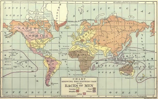
 Map of the Distribution of the Races of Men, from Niles, 1889, The Complete Geography: Mathematical, Physical, Political.
It was common-place to divide the human species not only into racial groups, but also by degrees of civilization, for instance, as here: Savage, Barbarous, Half-Civilized, and Civilized. According to the textbooks, the Caucasian race was the apogee of humanity, and the most “civilized.” Drawing from Warren, 1869, The Common-School Geography: An Elementary Treatise on Mathematical, Physical, and Political Geography.
Bear in mind that this was the great age of classification - everything in the animal and plant kingdoms was being categorized, as well as biomes, climatic zones, landscape morphology. Typologies were the new rage. Darwin's theory of evolution was also in the forefront of advances in scientific thought. Both scientific classification methods and the theory of evolution lent themselves to the categorization and the hierarchization of human groups, too, which probably seemed very progressive and "modern" to people at that time.
Map of the Distribution of the Races of Men, from Niles, 1889, The Complete Geography: Mathematical, Physical, Political.
It was common-place to divide the human species not only into racial groups, but also by degrees of civilization, for instance, as here: Savage, Barbarous, Half-Civilized, and Civilized. According to the textbooks, the Caucasian race was the apogee of humanity, and the most “civilized.” Drawing from Warren, 1869, The Common-School Geography: An Elementary Treatise on Mathematical, Physical, and Political Geography.
Bear in mind that this was the great age of classification - everything in the animal and plant kingdoms was being categorized, as well as biomes, climatic zones, landscape morphology. Typologies were the new rage. Darwin's theory of evolution was also in the forefront of advances in scientific thought. Both scientific classification methods and the theory of evolution lent themselves to the categorization and the hierarchization of human groups, too, which probably seemed very progressive and "modern" to people at that time.
The new “science” of racial typology was used as a justification for racial slavery. Some naturalists, like the renowned and well-respected Louis Agassiz, considered the races to be separate species, and many scientists in the mid-19th century were very actively engaged in research to “prove” polygenism, the idea that races came from separate origins (specifically separate creations), and were produced in different climatic zones and geographies. Although this theory went against a literal interpretation of the Bible, which states that all people descended from a single origin, polygenism was quite popular with many of the otherwise-religious slaveowners in the southern U.S., for the obvious reasons of giving "scientific" credence to their rights to subjugate another "species."
Bursting with Pride: U.S. Geography Textbooks, 1814-1948 (Part 1)
Bursting with pride, as well as with jingoism, racism, ignorance, misinformation, chauvinism, nationalism, and all the other -isms! As promised (see my blog posting of February 1, 2011, "One month with the geographer-at-large: It's been fun!") I am writing about the evolution of Geography textbooks in the U.S.
Geography textbooks, perforce, reflect the times in which they were written. They reflect not only the geographers’ worldviews, but those views which the authors desired to impose upon the children and young people reading the book and who presumably would be accepting the information as gospel fact. It is impossible to separate the “geography” from the surrounding times.
For instance, when the Reverend Jedidiah Morse’s “Compendious” Geography textbook was originally published in 1812, the United States was a small, new, and rather insignificant country, experiencing increasing and lingering tensions with Great Britain, which erupted into the War of 1812; and when the book was revised and reissued in 1814 (the edition I have) the U.S. was struggling to recover from that war, which had just ended in 1814. (The Treaty of Ghent, which marked the official cease of hostilities between the two countries, wasn’t signed until 1815.) The U.S. certainly did not stretch from “sea to shining sea” at that time, and “manifest destiny” had not even been invented yet as an excuse to plunder the western part of the continent. We were still a handful of former colonies, huddled mainly along the edge of the Atlantic Ocean, with the addition of some sparsely settled territories west of the Appalachian Mountain range and the then-as-yet-unmapped vastness of the 1803 Louisiana Purchase. Prior to earlier versions of Morse's Geography books which were first published in the 1780's, American school children had to depend on textbooks from the Mother Country. This would not do, after Independence. One small measure that could be taken to show a fledgling nation's independence from the old ways, the "despotism" of European monarchy, was to create an entirely new way to teach Geography, from a uniquely American perspective, by downplaying European (and especially English) ascendancy and by boosting pride in America. That is what Morse's textbooks aspired to do.
During the more isolationist periods of U.S. history, the geography books focus on minutiae about each individual US state, rather than devote correspondingly large amounts of space to entire continents, nations, and people outside our narrow purview. This translates into the division of space in a typical book (Pratt, 1882) being the descriptions of the various parts of the U.S. taking up about 85 pages; South America, about 20 pages; Europe (including sections on individual countries), about 50 pages; Africa, 6 pages; Asia, (including what we would call the Middle East) about 12 pages; and the Pacific Islands and Australia, only 2 pages.
A British geography textbook, published during the U.S. Civil War, treats the split of the nation matter-of-factly, discusses the the United States of America, and the Confederate States of America as if they were two completely separate countries that had never been one nation, and gives equal space and legitimacy to the section on the Confederate States. The British authors had totally naturalized the “fact” of disunion (even though there was still a war being waged over it, and the CSA was not a recognized state by any European nation). While officially neutral, there were strong geopolitical and economic reasons for Great Britain to keep up these appearances, since they did not want their supply of King Cotton from the southern Confederate States to be interrupted, among many other considerations.
And in the period of American expansionism and acquisition of overseas territories, geography textbooks reveled in the new information about these "exotic" places. A geography text book was reissued in 1898 for the express purpose of highlighting (and gloating about) the American Empire’s new properties acquired after the Spanish-American War of 1898, and indeed, the book leads off with descriptions of Hawai’i, the Philippines, Cuba, and Puerto Rico, in very prideful language (Redway and Hinman, 1898). This information was inserted as an update called a “Geographical Bulletin,” at the very front of the book’s new edition.
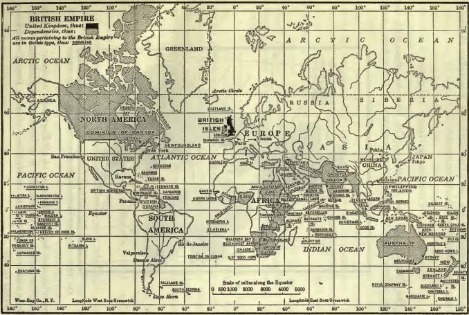
Map of the British Empire, from Whitbeck, 1922, Figure 324. Mercator strikes again!
A book published in 1922 divided the world into regions in an unconventional way. Rather than by nation or continent, as was usually done, the authors focused on four uber-regions: Latin America, Continental Europe, China and Japan, and the British Empire. The fact that the British Empire at that time covered so much of the rest of the world meant that very few places were omitted, after all (think India, Australia, Canada, large swaths of Africa, for instance, as part of the Empire. See map above). And the U.S. was covered in the first section of the book by being used as the examples for all the physical geographical terms and descriptions. The extended treatment of China and Japan was somewhat of a departure, also, but this was at the time of Japanese aggression against China (which was an international affair that had been going on for decades, with the fight for dominion over China involving France, Great Britain, Germany, the U.S., and Russia, as well as Japan), and the possibility of China becoming communist, and so this part of the world had become more visible and important to the U.S. Not coincidentally, Bertrand Russell wrote his influential book “The Problem of China” at around this time, which was also published in 1922. So it is perhaps not surprising that China and Japan should feature so prominently in a book from this time (Whitbeck, 1922).

A North Pole-centered map best shows relationships in an aeronautical world. Map from Renner, 1942, Figure 19. Human Geography in the Air Age (A Text for High School Students)
The idea of Geography textbooks being reflections of their times holds up even into the 20th century (and into the present, as well, of course). In a very interesting volume published in 1942, geographic concepts are presented through the lens of aviation, clearly reflecting the preoccupation with air power during WWII, and how aviation changed the world and how we see things, as well as the implications of the decreasing “distance” between places (Renner, 1942).
In a 2008 review of U.S. Geography textbooks, “Changing Perspectives in High School World Geography: 1950-2005,” the author concludes that “Five significant changes were noted: decline of national orientation and a greater focus on non-Western cultures; greater emphasis upon consumption over production; the accentuation of values clarification; increasing coverage of basic or prevocational skills; and standardization of format and content in textbooks. Many of these changes point towards a new cosmopolitan citizenship model, although some teachers and state social studies standards still see geography from a national perspective.”
According to his findings, geography textbooks are being written with less nationalism and less subjectivity. But I would reserve judgment on that. One hundred years from now, our textbooks (and everything else!) will be critiqued by people living in a vastly different world, who will find fault with what we have written, how we thought about the world, and what we deemed significant enough to pass on to the youth (not to mention them judging us by our actual actions or inactions). I’m sure our feeble attempts at objectivity will be seen as just as lacking as those shown in our look-back of books from the previous two centuries, no matter how hard we have tried to be fair, unbiased, and correct. It is the nature of things. We are always judged by those who come after us, by those who have no direct experience of the world in which we have had to negotiate. I am certainly no relativist, but I think we must not be too harsh when taking a close look at these old books and the messages they impart, and temper some of their excesses with an understanding of their historical milieu.
This posting is the first in a series of personal ruminations about Geography Education and Geography Textbooks, with further posts forthcoming over the weeks and months ahead, as time permits. Themes that I would like to explore in a comparative and longitudinal manner include 1.) “Mathematical Geography,” which is a now-obscure name for the study of map-making, map interpretation, projections, latitude-longitude, scale, and so forth. Mathematical Geography figures prominently in many of the Geography textbooks of the 19th and early 20th centuries; 2.) The evolution of thematic maps, which appear in the textbooks less commonly than reference maps, but increasing in usage over time; 3.) The changing description and portrayal of “races” and “nations,” as well as the changing definitions of those terms; and 4.) A longitudinal perspective of how two or three separate regions were discussed in these books, possibly focusing on China, Africa and/or Turkey.

1869 Map of Africa, showing the continent before partition by the European powers at the Conference of Berlin, 1884-1885. Note how there are few national boundaries delineated here, prior to the carving-up process in Berlin, and the vari-colored areas above depict vague and somewhat amorphous generalizations of African regions. Much of the African interior was stilll unknown to Europeans at that time, who had only a very fuzzy idea of what and who was where, and, with a few notable exceptions, most European knowledge about Africa was restricted to a thin strip of land along the coast. Map from Warren, 1869.
For the historical development of Geography as an academic discipline and the evolution of Geography education, see http://www.britannica.com/EBchecked/topic/229637/geography/272874/Historical-development-of-geography HINT: this one is especially useful for Geography doctoral students who feel they don’t have sufficient background in the “paradigms” of Geography, particularly regarding what happened “Between Humboldt and Harvey.” (kudos to Cindi Katz for coining that phrase in a curriculum committee meeting!) For Alex Standish’s review of 1950-2005 High School Geography Texts, see
Journal of Geography, Volume 107, Numbers 4-5, July 2008 , pp. 121-130.
For the full-text of the John Alfred Nietz book “Old Textbooks: spelling, grammar, reading, arithmetic, geography, American history, civil government, physiology, penmanship, art, music, as taught in the common schools from colonial days to 1900,” published in 1961 by University of Pittsburgh Press. This link is for Chapter 6 “Geographies: An Old Study”
Frontispiece from Adams, 1830, Geography: or, A Description of the World, in Three Parts
Geography Textbooks referenced above (Listed in chronological order of publication date. All books are out of print and out of copyright. Notice the grandiose titles of some of them!):
§ A Compendious and Complete System of Modern Geography, or, A View of the Present State of the World: Being a Faithful Abridgement of the American Universal Geography (Edition of 1812) with Corrections and Additions Made from information Since Received, Illustrated by a Representation of the Solar System - Morse, Jedidiah, 1761-1826, published 1814 (709 pages).
§ A Geographical View of the World, Embracing the Manners, Customs, and Pursuits of Every Nation - Phillips, R. (Richard), Sir, 1767-1840, published 1826 (Rev. Goldsmith).
§ Elements of Geography, Ancient and Modern: with an Atlas - Worcester, Joseph Emerson, 1784-1865, published 1828.
§ Geography: or, A Description of the World, in Three Parts: Part I – Geographical Orthography. Part II – A Grammar of Geography. Part III – A Description of the Earth, Accompanied by an Atlas, to which is Added, An Easy Method of Constructing Maps, Illustrated by Plates, for the Use of Schools and Academies. - Adams, Daniel, 1773-1864, published 1830.
§ Geography on the Productive System: For Schools, Academies, and Families - Smith, Roswell Chamberlin, 1797-1875, published 1839.
§ The Common-School Geography: An Elementary Treatise on Mathematical, Physical, and Political Geography. - Warren, David M., published 1869.
§ A Complete Course in Geography: Physical, Industrial, and Political: With a Special Geography for Each State. - Swinton, William, 1833-1892, published 1875.
§ The Guyot Geographical Reader and Primer: A Series of Journeys Round the World. - Pratt, Mary Howe Smith, published 1882.
§ The Complete Geography: Mathematical, Physical, Political - Niles, Sanford, published 1889.
§ Natural Advanced Geography - Redway, Jacques, and Hinman, Russell, published 1898.
§ A Complete Geography - Tarr, Ralph S., 1864-1912, published 1902.
§ The High School Course in Geography - Whitbeck, R. H., 1871-1939, published 1922.
§ Human Geography in the Air Age (A Text for High School Students) - Renner, George T., 1900-1955, published 1942.
§ Elements of Geography: Physical and Cultural – Finch, Vernor, and Trewartha, Glenn, published 1948.