
The Global Peace Index – lower scores (dark green) are more peaceful countries. New Zealand is the #1 most peaceful nation with a score of 1.2; Others in this dark green category are Ireland, 1.3; Chile, 1.4; Malaysia, 1.5. Slightly less peaceful (light green) are the UK, 1.64; Vietnam and U.A.E. with 1.66 each; Bosnia, 1.75; and Egypt, 1.77. Even less peaceful countries (yellow) include China, 1.9; the U.S., 2.0, (same as Rwanda, Bangladesh, Syria, and Kazakhstan); Still less peaceful (orange): Iran, Angola, and Jamaica, 2.1; Guatemala, 2.2; And very extremely un-peaceful (red): Haiti, 2.3; Myanmar, 2.5; Nigeria, 2.6; Russia, 2.7;Pakistan, 2.8; Sudan, 2.9; Israel, 3.0; Somalia, 3.2; and at the top (or bottom) of the list is Iraq, with a score of 3.34. Iraq ranks #144 out of 144 countries, and the U.S. ranks # 83. Of course, class breaks are everything in this kind of map display – the U.S. is the last in the yellow category, separated from the next country in the top of the orange category by 3 thousandth of a point. http://www.visionofhumanity.org/gpi-data/#/2010/GINI
Continuing with the theme of mapping global indices, here is an interesting idea – can peace be mapped?
The website “Vision of Humanity” of the Institute for Economics and Peace, has assembled a list of factors they believe go into making up a peaceful nation, and they have used these variables to construct and map a “Global Peace Index.” According to the information on their website “The Index is composed of 23 indicators, ranging from a nation’s level of military expenditure to its relations with neighbouring countries and the level of respect for human rights. The index has been tested against a range of potential “drivers” or determinants of peace—including levels of democracy and transparency, education, and national wellbeing. The team has used the latest available figures from a wide range of respected sources, including the International Institute of Strategic Studies, The World Bank, various UN offices and Peace Institutes and the Economist Intelligence Unit. The Global Peace Index is intended to contribute significantly to the public debate on peace.”
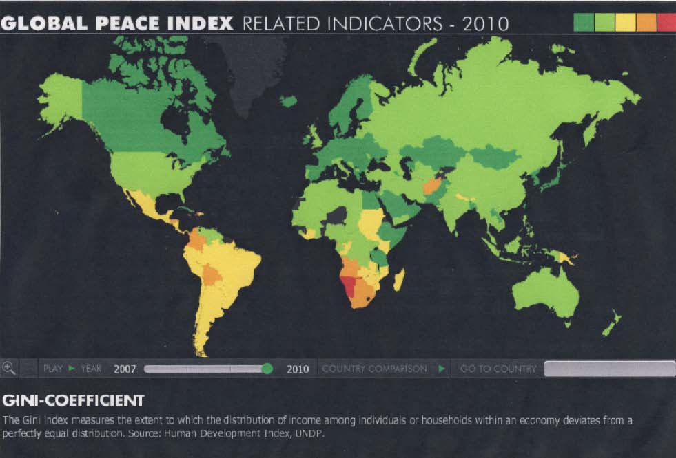
These indicators can each be examined and mapped individually on their website.
Additionally, there are many “related indicators,” which can also be mapped independently, such as the country’s electoral process, political participation, civil liberties, gender inequality, freedom of the press, youth bulge, various education and literacy parameters, and health variables like infant mortality and life expectancy. The related indicators also include our old friends, the Gini coefficient and the per capita GDP.
When you look at the 2010 map of the Global Peace Index on their website, you can see that the U.S. is judged to be a less peaceful country than, say, most of the North African countries, northern and western European countries, and Chile. The U.S. was in the same “peace index” category as China, Serbia, Albania, Indonesia, Peru, Bolivia, Ecuador, and Namibia. I believe that these high numbers on the peace index for the U.S. (indicating less peacefulness) is largely influenced by the factors of “military expenditures,” “armed service personnel,” “jailed population,” and “number of conflicts fought,” as opposed to the reasons why other countries in the same category might have made the list, such as “political instability,” “violent demonstrations,” and “potential for terrorist acts,” (although, of course, any war-making can be considered a terrorist act). I find it interesting that the likely reasons the U.S. is within a less peaceful category do not really impact the level of peace within the country. Our high ranking index (low peacefulness) seems to be based on the potential and actual havoc caused outside our borders, which is a very different sort of un-peacefulness than that of a country with conflict and un-peacefulness within their borders, but apparently the index does not take this into account and differentiate between the two. The website does not give us details about how the index was constructed, and whether certain factors were given more weight than others, and if so, how was the weighting scheme determined.
I think this index is an admirable attempt to quantify something very elusive. I also give kudos to the team who developed the index for being able to amass the many data sets on a global level, which is devilishly tricky to do, as anyone who has worked with global data knows.
A few years ago (in Fall 2006, to be exact) a group of GISc/Geography students undertook a group project to develop a model to predict armed conflict on a global scale. One of the biggest problems was data – not only finding the appropriate data and figuring out what would be the most salient factors to measure the potential for violence, but finding data for every country, and even then when found, knowing that there were huge inconsistencies in how the data were reported and what they actually denoted, varying wildly from country to country, as well as temporally. Many of the factors the students used for their index were similar to those used in the Global Peace Index, and it is instructive to compare the two results. There are some similarities (South America and much of Asia) but some striking differences (northern Africa figured in the students’ version as a place of likely conflict, whereas in the GPI it is mainly in one of the most peaceful categories).

Poster of the student group project “Predicting Armed Conflict,” completed for the class “Environmental Modeling and Spatial Analysis,” Fall 2006. The students were Justine Ahlstrom, Natalia Brzezinska, Stephen Franciosa, Andrew Maroko, and Brian Morgan.


http://www.theatlantic.com/international/archive/2011/03/predicting-revolution-the-index-of-potential-unrest/71743/ Then, there is Richard Florida’s Index of Potential Unrest. “Inspired by The Economists' efforts and emboldened by its self-criticism, I decided to try to build an index of my own--the Index of Potential Unrest (IPU). With the help of my colleague Charlotta Mellander, we pulled together statistics from 152 nations and sorted them according to eight key variables: human capital levels in combination with percent of the workforce in the creative class, life satisfaction, GDP per capita, perceptions about local labor market conditions, Internet access, freedom, tolerance, and honesty in elections. The data comes from the World Bank, the International Labor Organization, and the Gallup Organization. The map [above] shows how these nations stack up.”
I don't know why I couldn't leave a comment, probably my browser acting up. In any case, fascinating, but tricky. There are influences between places, and they are real, and I don't have any idea how to quantify them.
ReplyDeleteCertainly, ideas and movements can spread. The urban riots of the 60s, jumped from city to city. In Britain in 80 or 81 (I was in high school, not sure of which year) same thing. Decolonization, from place to place, sometimes in batches, sometimes singly, all somewhat linked, all somewhat independent.
And then we just don't know what US policy will be, but it is a huge factor in peacefulness (strange word). Which regimes will the US prop up with money for development, and which with arms? And which will the US watch fall?
Jonathan
Yes, that's what makes these global indices so tricky - actually, any kind of predictive model tricky - all the unknowns. There is no way that every salient variable can be captured in a model, and then there are, of course, events that happen seemingly out of the blue. These events can snowball and diffuse geographically. And then all bets are off! Indices, predictive models: out the window!
ReplyDelete